

This collector (who I'll refer to as "L") had previously purchased one of my favorite larger paintings called Positivity in early 2011. When L contacted me in late 2012 about creating a large scale piece for their new home, inspired by my linear works in 2010 (specifically noting Balancing Act), I, of course, jumped at the opportunity.
The first thing that struck me was the extremely large scale - 35" x 70"! Typically I paint intuitively and make changes as I go, but for something that large, if I worked without a plan in mind, I could potentially use up gallons of paint and waste a lot of time "learning" (aka making mistakes) along the way. Instead, I chose to be more mindful and prepared than ever before. Through this process, the painting truly was a combined creation based on L's input and reaction to every sketch and color sample I sent.

I began by sending sketches to L to get a sense of how much/little space/action she wanted in the composition. In all my initial excitement about the project, I missed the tiny (oh wait, I mean, oh so significant) detail that the piece was to be hung vertically. Oops. Either way, she liked the bottom sketch out of the three. So I followed up with this sketch, showing the kind of movement I'd like to see in the vertical format.

As you can see, this sketch is pretty rough - but it captured the feeling of interlocking shapes and broken lines I was hoping for. I find it interesting that the top left corner's forms sort of worked their way into the final piece unintentionally.
Next up: A color palette.

These are the paint colors I decided I wanted to work with after seeing the colors in the area the painting would be hanging.

Here are some mixed tones that I was thinking of working with. L liked the peacock blues and greens and warmer/lighter colors.


I also sent along these quick painterly sketches. The general consensus I got was that I was working in the right direction, but the final painting should be over-all much lighter in value, and I agreed.
Now that all of that preliminary work was sorted out and discussed, I had everything I needed to get to work on the canvas itself. Even though I did a lot of planning, I still didn't go so far as to sketch out the exact composition or color block every area beforehand. Some things still need (for me) to be worked out on the actual surface in actual scale to click and to make sense (or not).
Since I was working in the middle of winter, my backyard studio wasn't available and I had to work in my basement. No problem there - I had a space heater and my Pandora radio stations to keep me company. One issue was that we have wood paneling and I would be stretching the canvas right onto the wall. After trying to think up all kinds of ideas to work on a flat surface without the grooves of the paneling, I finally figured out a really cheap and easy fix - packing tape! Mind you, that whole length of wall in our basement is dedicated to me painting on it and getting it messy, so this technique obviously won't work for everyone. I'm sure if I removed the tape, it would be an ugly scene. But since I don't care about that and neither does my husband, it worked perfectly. (Side-note: I used good quality packing tape - cheaper tape might not have lived up to the task.)
With measuring tape, a pencil, and many acrobatic stretches, I marked off the 35" x 70" dimensions onto a roll of unstretched canvas. L wanted the canvas to extend and wrap around the 2" deep stretcher bars, so I cut the canvas with a lot of extra room to spare and "stretched" the canvas onto the wall with a lot of thumbtacks. The total length took up the entire height of the wall with maybe a few inches here or there to spare. As if it was made for the job, the awkwardly low office chair I inherited from my parents some years ago finally found its purpose. I switched from standing working, to sitting on the chair and wheeling around, to sitting on the floor.
I usually like to flip my paintings around to see if the composition is really working, and that is generally pretty easy when you're working on an easel. I flipped this painting probably four or five times with the help of my husband. The first time we were humorously cautious and awkward trying to figure out how to do this without getting any creases in the canvas. After a couple times though, we were handling the situation like pros. (Without his help it would have been a different story!)

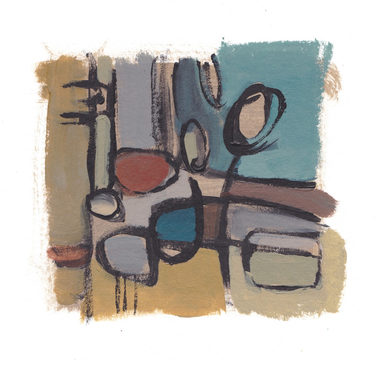
The first Work In Progress (WIP) shot I sent was just to get a general sense of how the composition was coming along. At this stage in the game, I was really experimenting with color to see how it looked with the others. Some things were glaringly wrong already - the yellows too bright, some of the blue/greens too dark, and some other colors just not "right" somehow. The only color I was figuring out at this stage was the color of the linework - a darker gray rather than the black I usually use in paintings like these.

The second WIP shot shows things moving in the right direction but we both agreed it was still too dark over-all and L wanted less browns.

By the third WIP shot, I was getting closer. As any artist will tell you, the general rule is to work big to small, general to specific, and now it was time to talk detail. In an effort to make communication easier for us, I printed out a copy of the painting and numbered all of the areas of color.

This made things so much easier for us! Instead of having to say something like "that little semi circle of yellow in the bottom right next to the big blue swoop", L and I could refer to areas by number - simple and easy.
The reactions I got from L at this point were remarkable - her eye was picking up the same problem areas that I was seeing too. So I followed up with some possible re-working for the areas that needed extra attention. (Drawing over print-outs.)


Some final changes were made after discussing the sketches....

...and then the painting was complete! (Seen above hanging in the studio to get a natural light shot.) Signed and dated on the back, I rolled it up, wrapped it up, and shipped it off to Australia.
I learned so much from this experience and thoroughly enjoyed every step of the process. Having a customer as wonderful as L definitely made it easy - she trusted my instincts but also didn't hesitate to communicate what was working for her and what wasn't. It was a natural fit and I want to thank L for allowing me to share these pictures of the painting stretched and hanging in their home. After sending me these pictures, L asked me if I had a title for the
piece. I didn't... until I saw it hanging in its home and one word came
to me.... Continuum.
I also would like to thank L for entrusting me with this incredible opportunity to bring my art into her home on such a large scale.
It was an honor. It was a painters dream come true.

