Showing posts with label abstract. Show all posts

Tuesday, September 23, 2014

The Cape Cod Collection

https://www.etsy.com/listing/194285993/original-painting-beach-decor-abstract

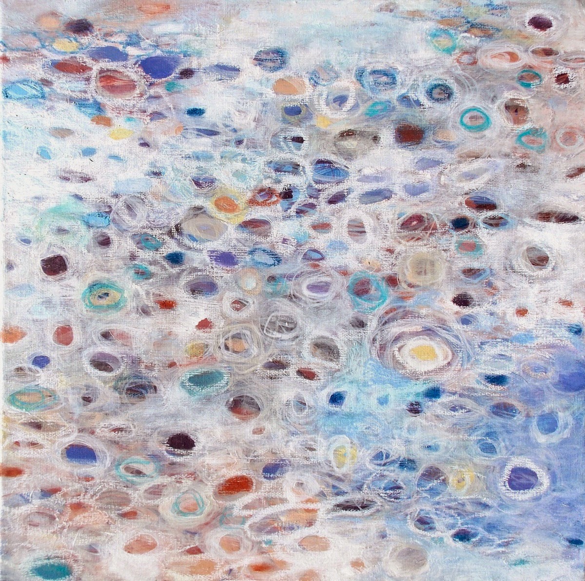
Tide Pool Reflections 1 - Acrylic and oil pastel on 24" x 24" canvas, 2014

There is something that happens to you when you spend even just a couple of days by the ocean. That magic something happened to me this past June when my husband and I went on an anniversary trip to the Cape (where we married and honeymooned 8 years ago). 


https://www.etsy.com/listing/194456979/beach-decor-art-abstract-painting-12x12?ref=shop_home_active_13

Tide Pool Reflections 2 - Acrylic and oil pastel on 12" x 12" canvas

During this wonderful trip (now 3 months ago) I experienced a sense of peace that I really can't say I've ever experienced before. With some reflection, I now understand why. 

1. We camped. 

The media/entertainment/news-feed of our modern society can become not only addicting and something to obsess about, but also alter who we really are. It was so great to get away from technology - the television, the internet, our online businesses and who left a review for one of Rob's books on Amazon and who favorited one of my Etsy listings. Being in nature and connecting with nature's rhythm was so very good for the soul. #mediablackout

2. We were on the freaking Cape. 

Not only does it hold a bounty of good memories and heart strung connections for us personally, the flexed arm of New England is everything that a laid back traveler could want. There's room for every kind of New Englander to get their taste of the Atlantic - from the super wealthy (hello Kennedys?) to your average Joe and Josephine getting clam strips from a roadside stand. Life is good on the Cape. Whoever you are you can make it work... and thensome. #tartarsauce

3. The beach has magical powers. 

This is where I feel for my landlocked friends. If you've never been to "the beach", than you really do not know what you are missing. The ocean is the best anti-whatever-ails-you antidote that I've ever experienced naturally. People come to the shore to veg and let it all hang out. You could say that in the outer Cape, that is more true than other many other oceanside locations internationally. (he he - #nudists!) 


Tide Pool Reflections 3 - Acrylic 12" x 12" canvas, SOLD


If you've been paying attention, I've shared 3 paintings titled the same. Tide Pool Reflections 1-3

It was our last day on the Cape and we were at a bay side beach. The tide went out for as far as the eye could see, but in between here and there were many tide-pools - from knee deep to just barely covering the top of your feet. As any normal person connected to their inner child would do, I skipped my feet in the water, watching the beautiful patterns of swirls and circles of light dancing on the surface of the water before me.

And that was the beginning of a series. 


Serenity by the Sea - Acrylic and oil pastel on 18" x 24" canvas, SOLD

This series was yes, about the reflections of light on water, and New England earthy sand vs the salty sea BUT it was also about transcending petty problems and just living in the moment. It gave me the idea that hey maybe I could feel this way - this zenned out, happy and fullfilled way, any time I wanted. And wasn't that radical. 


https://www.etsy.com/listing/201540432/large-original-abstract-panting?ref=shop_home_active_2

Song of the Sea - Acrylic and oil pastel on 24" x 36" canvas

Check out all of the mellowed out, ocean inspired, Cape Cod Collection here: https://www.etsy.com/shop/JessicaTorrant?section_id=15658933


Wednesday, April 09, 2014

2014 Mojo

Hello! Is anybody out there?

I've sadly neglected my blog in such a major way that it has been almost a full YEAR since I've posted! Time to get my bloggin' boots on and just dive right back in.

After a rough, seemingly endless Winter in New England, Spring has actually made an appearance just recently and I've been able to get back into my backyard studio. That means painting season is officially back on for me and I couldn't be happier about it!

Here is my first painting of 2014.

 Radiance - Acrylic on 22" x 28" canvas, 2014


Also available as a print in multiple sizes: http://society6.com/JessicaTorrant/Radiance-XX7_Print#1=45

Wednesday, May 08, 2013

Love Song

©2013 Jessica Torrant
LOVE SONG
Acrylic, 16 x 20 inches

Thursday, April 25, 2013

All of It


©2013 Jessica Torrant
ALL OF IT
Acrylic on canvas, 18 x 24 inches

Thursday, February 28, 2013

Australian Commission 2013


It is a rare privileged as an artist to see your work hanging in a collector's home. It is rarer still to have permission to share it with the world! The above piece was a custom painting commissioned by a collector in Australia, and it was probably the most challenging and exciting commissioned paintings I've ever done.

This collector (who I'll refer to as "L") had previously purchased one of my favorite larger paintings called Positivity in early 2011. When L contacted me in late 2012 about creating a large scale piece for their new home, inspired by my linear works in 2010 (specifically noting Balancing Act), I, of course, jumped at the opportunity.

The first thing that struck me was the extremely large scale - 35" x 70"!  Typically I paint intuitively and make changes as I go, but for something that large, if I worked without a plan in mind, I could potentially use up gallons of paint and waste a lot of time "learning" (aka making mistakes) along the way. Instead, I chose to be more mindful and prepared than ever before. Through this process, the painting truly was a combined creation based on L's input and reaction to every sketch and color sample I sent.


I began by sending sketches to L to get a sense of how much/little space/action she wanted in the composition. In all my initial excitement about the project, I missed the tiny (oh wait, I mean, oh so significant) detail that the piece was to be hung vertically. Oops. Either way, she liked the bottom sketch out of the three. So I followed up with this sketch, showing the kind of movement I'd like to see in the vertical format.


 As you can see, this sketch is pretty rough - but it captured the feeling of interlocking shapes and broken lines I was hoping for. I find it interesting that the top left corner's forms sort of worked their way into the final piece unintentionally. 

 Next up: A color palette. 


These are the paint colors I decided I wanted to work with after seeing the colors in the area the painting would be hanging. 


Here are some mixed tones that I was thinking of working with. L liked the peacock blues and greens and warmer/lighter colors. 


I also sent along these quick painterly sketches. The general consensus I got was that I was working in the right direction, but the final painting should be over-all much lighter in value, and I agreed.

Now that all of that preliminary work was sorted out and discussed, I had everything I needed to get to work on the canvas itself. Even though I did a lot of planning, I still didn't go so far as to sketch out the exact composition or color block every area beforehand. Some things still need (for me) to be worked out on the actual surface in actual scale to click and to make sense (or not).

Since I was working in the middle of winter, my backyard studio wasn't available and I had to work in my basement. No problem there - I had a space heater and my Pandora radio stations to keep me company. One issue was that we have wood paneling and I would be stretching the canvas right onto the wall. After trying to think up all kinds of ideas to work on a flat surface without the grooves of the paneling, I finally figured out a really cheap and easy fix - packing tape! Mind you, that whole length of wall in our basement is dedicated to me painting on it and getting it messy, so this technique obviously won't work for everyone. I'm sure if I removed the tape, it would be an ugly scene. But since I don't care about that and neither does my husband, it worked perfectly. (Side-note: I used good quality packing tape - cheaper tape might not have lived up to the task.)

With measuring tape, a pencil, and many acrobatic stretches, I marked off the 35" x 70" dimensions onto a roll of unstretched canvas. L wanted the canvas to extend and wrap around the 2" deep stretcher bars, so I cut the canvas with a lot of extra room to spare and "stretched" the canvas onto the wall with a lot of thumbtacks. The total length took up the entire height of the wall with maybe a few inches here or there to spare. As if it was made for the job, the awkwardly low office chair I inherited from my parents some years ago finally found its purpose. I switched from standing working, to sitting on the chair and wheeling around, to sitting on the floor. 

I usually like to flip my paintings around to see if the composition is really working, and that is generally pretty easy when you're working on an easel. I flipped this painting probably four or five times with the help of my husband. The first time we were humorously cautious and awkward trying to figure out how to do this without getting any creases in the canvas. After a couple times though, we were handling the situation like pros. (Without his help it would have been a different story!)


The first Work In Progress (WIP) shot I sent was just to get a general sense of how the composition was coming along. At this stage in the game, I was really experimenting with color to see how it looked with the others. Some things were glaringly wrong already - the yellows too bright, some of the blue/greens too dark, and some other colors just not "right" somehow. The only color I was figuring out at this stage was the color of the linework - a darker gray rather than the black I usually use in paintings like these. 


The second WIP shot shows things moving in the right direction but we both agreed it was still too dark over-all and L wanted less browns. 


By the third WIP shot, I was getting closer. As any artist will tell you, the general rule is to work big to small, general to specific, and now it was time to talk detail. In an effort to make communication easier for us, I printed out a copy of the painting and numbered all of the areas of color. 


This made things so much easier for us! Instead of having to say something like "that little semi circle of yellow in the bottom right next to the big blue swoop", L and I could refer to areas by number - simple and easy. 

The reactions I got from L at this point were remarkable - her eye was picking up the same problem areas that I was seeing too. So I followed up with some possible re-working for the areas that needed extra attention. (Drawing over print-outs.) 


Some final changes were made after discussing the sketches.... 


...and then the painting was complete! (Seen above hanging in the studio to get a natural light shot.) Signed and dated on the back, I rolled it up, wrapped it up, and shipped it off to Australia. 

I learned so much from this experience and thoroughly enjoyed every step of the process. Having a customer as wonderful as L definitely made it easy - she trusted my instincts but also didn't hesitate to communicate what was working for her and what wasn't. It was a natural fit and I want to thank L for allowing me to share these pictures of the painting stretched and hanging in their home. After sending me these pictures, L asked me if I had a title for the piece. I didn't... until I saw it hanging in its home and one word came to me.... Continuum

I also would like to thank L for entrusting me with this incredible opportunity to bring my art into her home on such a large scale. 

It was an honor. It was a painters dream come true. 


Monday, March 26, 2012

Painting Season Begins

Happy Spring! 

In classic New England style, the end of this March has included wearing everything from winter boots and layers, to flip flops and tank tops as the weather greatly fluctuates - even flirting with summer temperatures (though we're expecting a frost tonight). As soon as I see my daffodils blooming, I know my painting studio is open for business!

This winter I did more painting than usual inside my home, but that was in preparation for a show. Even though I love the paintings themselves, there is nothing to compare working in my real workspace vs crammed in our kitchen. Ahh... to be outside again...

Here are the first paintings completed in my studio in 2012.


In other news, I am thrilled to announce that I am now working with McGaw Graphics to reproduce many of my latest paintings in the Fresh Impressions series. They won't be available until May but you can be certain I'll keep everyone updated when they are released. This is such a thrill for me and I feel I need to give a little backstory to tell you why.

When I was 16/17, I got my first real job at a picture frame shop in our local mall. My high school art teacher hooked me up with the job because he was friends with the owner and I quickly fell in love with all aspects of the trade. Picture framing ended up becoming my full time trade for many, many years to follow and was my last "real" job before pursuing an art business full time. Going back to those early days in a small shop, there was a lot of down time towards the end of the night if all the jobs were completed, and I often spent the last half hour gazing through print catalogs. Now everyone gets their prints online, but at the time, we special ordered tons of prints via catalog for customers. Out of stacks of catalogs only two do I remember; Bruce McGaw and Applejack Graphics. Bruce McGaw was the go-to catalog for most requests - I recall them carrying pretty much everything under the sun. Applejack was my personal favorite because it featured living "unknown" artists (aka no Monet's, Renoirs, etc) and they had a little picture of the artist (often in their workspace) and an artist bio at the top of their page of prints. I looked through Applejack dreaming of someday living like those artists, and the artwork I discovered on those pages was my first exposure to what living, working artists were painting/creating in the "here and now". Of course the "here and now" then was *gulp* almost 20 years ago, so let's fast forward to the "here and now" now

In January I was contacted via my Etsy shop by a representative from McGaw graphics to license some of my paintings. (The fact that I had just had a brief "affair" with another website to sell my art and then quickly returned back to Etsy in time to get discovered by this person was definitely not lost on me. Phew!) Since then, via many exchanges, I am officially on board, the contract was signed, sealed and delivered, and I couldn't be happier about it. McGaw Graphics works with interior design firms, picture framers, department stores and they have a beautiful website and still offer catalogs. They are also affiliates with many popular art sites such as art.com, artprints.com and many others, so don't be surprised if you see my pieces start to pop up there as well.

So let's get to what makes this so crazy - Bruce McGaw was bought by... APPLEJACK GRAPHICS! Hence the name change. Isn't that wild? So they are now basically the best of both worlds. They represent Disney as well as many modern master's estates (Rothko, Pollock for example) but at the same time, they represent many living, working artists today such as myself. It's just too cool the way things come around full circle. A little nibble of inspiration in 1994 has circled around to bless me with opportunity in 2012. What a world...

One final tidbit, in the early 2000's I submitted my art for review to Applejack before they merged with Bruce McGaw (something I knew nothing about until this all came up recently). I was rejected. The lesson is, once again, don't ever give up when it comes to your passion, your creativity. You never know when an opportunity will come along that will validate all of your years of hard work, determination and effort!

Thursday, February 16, 2012

Looking Ahead Take 2

"Softly She Whispered..." - Acrylic on 24" x 36" canvas, 2011

If you happened to catch one of my earlier posts from about a month ago (I just took it down so there is no confusion), I had set up a new website to sell my paintings. After some time figuring out how things worked on that site, I realized there were some problematic issues that prevented me from being 100% convinced I made the right decision. Facing "make it work or move on", I decided to let it go and refocus on my Etsy shop. Etsy isn't perfect either, but weighing the pros and cons, it became a no-brainer to make the most of my Etsy shop. So! There ya go. Once again I have publicly jumped up and down about something only to say, "No, wait, um, hold on a minute, actually..." But that's how it goes when you share your process on a blog, right? 

Anyway, I am excited to get back into the flow again on Etsy and more importantly IN THE STUDIO! I am going to share two of my new 2012 paintings that got deleted in that older post. Thanks for bearing with me! 

Blizzard - Acrylic on 18" x 24" canvas, 2012


Four Seasons - Acrylic on 18" x 24" canvas, 2012

Tuesday, February 07, 2012

Sunday, January 08, 2012

First paintings of 2012

 Midnight - Acrylic on 8" x 10" canvas panel, 2012


 Painter's Play - Acrylic on 8" x 10" canvas panel, 2012


 Reverb - Acrylic on 8" x 10" canvas panel, 2012


Softly Spoken - Acrylic on 8" x 10" canvas panel, 2012

Saturday, December 03, 2011

Fresh Impressions Preview: After Noon

After Noon - Acrylic on 24" x 36" canvas, 2011

I think this is my favorite of the new series. It is a now-not-so-secret nod to Lee Krasner's painting Noon that has firmly planted itself in my mental slideshow of paintings that have rocked my world for life. I think that Noon was the original subconscious inspiration to create this series, now that I have had the opportunity to take a step back and take it all in. Monet's water lilies were also part of that mental slideshow - the abstract moments of color and mark are spectacular when you see the giant canvases in person (which I was fortunate to do years ago at the MoMA). Of course, at the end of the day, these paintings are mine. Sometime late last year I got into circles. The circles began to deconstruct. The marks became looser. Everything became more freeing. The process is what has driven this new series but that's me talking as the artist. In time, I think I will see these paintings more clearly from the perspective of the observer and I will then understand them more completely.

This painting is one of twenty that will be exhibited at the Good News Cafe through January 31. See previous post for more information.

Wednesday, July 28, 2010

Campfire

Campfire - Acrylic on canvas, 8" x 10"

Friday, July 16, 2010

Summerscape


Summerscape - Acrylic on 12" x 12" canvas panel.

Thursday, July 15, 2010

Round and Round

Round and Round - Acrylic on 12" x 12" box canvas.

Wednesday, July 14, 2010

Secret Code

Secret Code - Acrylic, fabric and gel medium on 12" x 12" box canvas

Tuesday, July 13, 2010

Surrender

Surrender - Acrylic on 10" x 13" canvas

Glow

Glow - Acrylic on 8" x 10" canvas

Saturday, June 12, 2010

Summer Showers


Summer Showers - 12" x 15.75" canvas


Today I finished this canvas I bought in Ireland last fall. It had been going in another direction so I decided to work over it with this technique, taken an extra step further by "whiting out" the negative space around circles instead of circle chains, as I've been doing. (See previous posts and the Connections series). I feel really free right now in the studio - able to take chances and go against what's familiar. I'm listening to those thoughts that inquire "what if I did this?" and answering, "I don't know, let's find out!". I'm working a little slower, more conscious and detailed. Of course, the effect I want is something dreamy and loose so the marks are more impressionist than hard lined - not sure if detailed is the right word, but that's how it feels.

I think this piece conveys the atmosphere I've been surrounded by all week - wet and misty, damp, heavy air, vivid greens and sparkles of dew drops. Of course I love a hot, blue sky summer day like the next girl, but these moody, rainy days have their own energy that is quietly comforting.

Friday, June 11, 2010

Paint it out

Not Quite Chaos - Acrylic on 16" x 20" canvas


Joyful in June - Acrylic on 16" x 20" canvas

I felt a little blue this morning. I know it's the slow time of the year, but just a nibble would do wonders for my confidence right now. Knowing that wallowing or starting to think/act desperately would be futile, I pushed myself into the studio where paint would (and did) take me away.

I have been painting without music lately. I'm so used to years of painting with some other distraction be it listening to the radio or even playing a movie in the background. Somehow it took my attention away just enough to keep things loose and fluid. These days I'm just enjoying the sounds of the forest. An extra bonus has been the daily visit (yesterday and today) from turkeys making their way through the woods behind the studio. They forage on bugs on low growing plants right out back. If I'm really slow and still I can get a really close view of them feeding just feet away. The wonderful thing about it is... there's babies!!! Lots and lots of them! By my estimation today I think there are anywhere from 15-20 in that little tribe led by three adults, perhaps even more. They are too cute for words as they cheap and tweet and bounce up to grab especially tasty bugs.

A tasty meal, a hot shower and a hug from my husband later and I feel just fine. Being productive is my salvation, it really is. I can't just sit and feel sorry for myself or let my mind wander into fear territory. It's never helped me in the past, it certainly won't now. I've just got to keep working and believe that things will work out as they always do. Faith in the future. Comfortable and confident in the present. That's the name of the game.