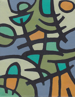
 Here's a new painting from the batch of four 8" x 10" canvases I was working on in the video series (see last post) called Song For Spring.
The videos shot on my Mac are in reverse - anyone know how to flip them?
Also, I'd like to continue making these videos and if you have any questions for me I'd love to answer them as I gab while I paint. It could be about anything - art, life or otherwise. If you have a website I can mention it when answering your question (a little free advertising never hurt anybody). Thanks!

3 comments:
Hi Jessica,
Brilliant idea of taking questions from us for your videos.
I am curious about which colours (names) are being used. I luv those Golden transparent colours but wonder which would be best for high density opaques.
How about pours Jessica and skins -have you any opinion on these? How to avoid crazing in these would be great info.
I am an amateur abstract dabbler and would love to know how different effects are made.
I'm going to look back over all your gorgeous work and see if there is anything you might like to explain.
Thanks! Sherrill
Hi Sherrill! I'm going to go ahead and answer your question here because it's one of those things where I'll probably explain myself better in the written word rather than "live" so to speak.
SO... first let me say that I encourage other artists to share their replies to Sherrill's question as well. I'm such an experimental painter I often don't take into consideration the more technical side of things. That being said, I follow the general rule of thin to thick and that's worked for me through the years. I mix a lot of brands of different paint, whatever I have on hand at the time is what I use be it Golden, Winsor & Newton, a brand made by Jerry's Artarama that is (I think) called Chroma, Liquitex and even the Basics brand which believe it or not produces a long lasting vivid color. It's rather thin, but that's why I like it for the first layers. Some artists may poo-poo the Basics brand but it works for me and what I do. (If someone wants to try out acrylic painting, I would recommend buying Basics to start with but maybe pick up a higher quality white, like Golden or Liquitex because a quality white is deserving of the extra money).
As for particular colors, again I welcome other artists to come in and lend a helping hand about this. I have a lot of different colors in the paint box, but the colors I most frequently rely on are cadmium red medium or deep, cadmium yellow medium for a straight forward yellow and more opaque than cadmium yellow light which I also keep around for it's brightness. Phthalo blue is probably my dearest love, mixed with various levels of white it sings and a touch of cad yellow light and it's a spring bright green. Love it. Also love a medium violet that creates beautiful oranges mixed with yellow, pinks with white, and a cobalt blue when mixed with phthalo. For some reason I like that mix rather than actual cobalt blue out of the tube. But again, that's just me. Browns like burnt sienna are great (and a must have) but I like to mix most of my browns with complimentary pairs of the colors I've mentioned. Lastly is black and titanium white. White speaks for itself but black... when I was in school we were taught how to mix our darks - the idea of using straight black out of the tube was a big no no. I've carried that with me for YEARS even though now I paint abstracts instead of figure studies. It dawned on me literally within the last year that the reasoning for mixing darks IN FIGURE STUDIES is to get real, rich darks that you see in life - but with abstracts, it is about something entirely different - JUST COLOR. Not color relating to a subject, just colors relating to each other. So I've been having to remind myself that there is a whole range of colors that can be created mixing black in. Some old rules need to be broken or understood as no longer applicable. :)
As for skins and mediums, I'm hooked on Liquitex gloss or matte medium. The glazes and layers of translucency you can create are beautiful. I like the medium/varnish kind because it's performing a double duty. The other mediums I use to create texture are all Golden brand.
Thanks again Sherrill and happy painting to you!
Finally getting a chance to look at what you have been working on and loving it. This painting definitely caught my eye. You amaze me.
Post a Comment